It's interesting to compare the difference in approaches that they have in comparison to the likes of IKEA; they both have a vast range of different products therefore the layout of the catalogue needs to cater for displaying all the different products while sustaining a consistent format.
Muji Life 2009 - 2010 UK
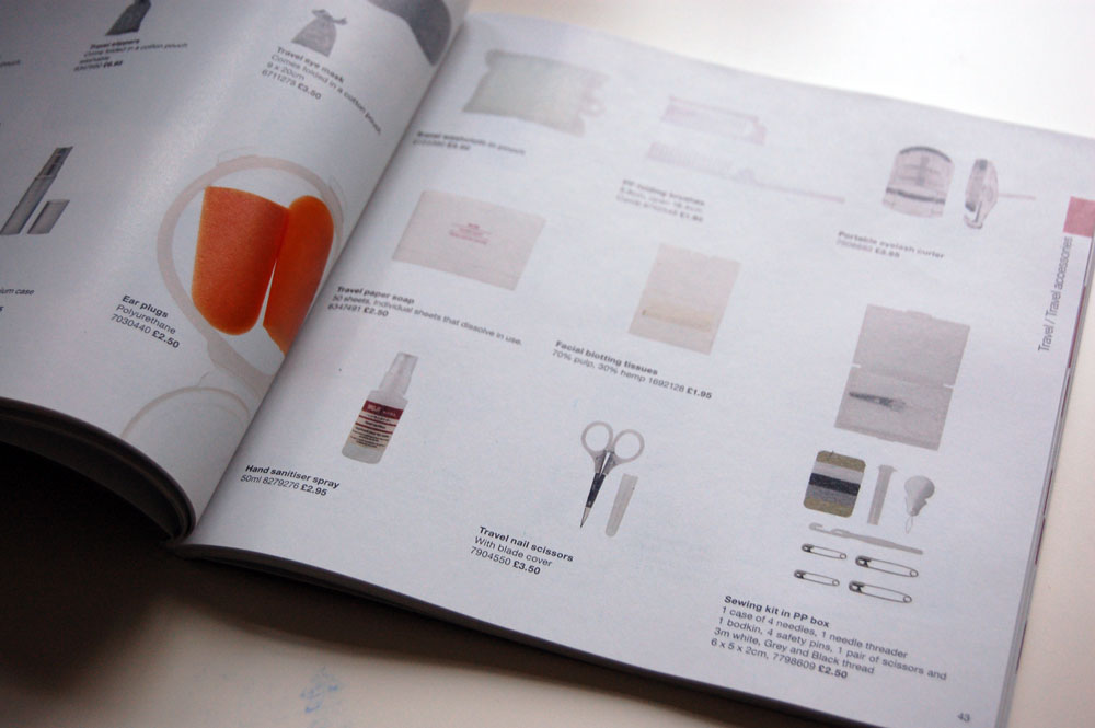
A square format catalogue that contains all of the available Muji products to the UK market. A very nice minimal and functional catalogue that displays the products in a well considered format accompanied by clean cut typography. All the products have been photographed to a high standard, in keeping with the minimalistic feel of Muji as a brand.


Muji Catalogue - Hong Kong
A pretty different design direction for something that is pretty much the same thing except that it's distributed in a different country; the Hong Kong Muji catalogue uses the same product photos but the layout is quite different compared to the UK version. Similar to the UK version, aswell as using the same product shots, the content is often broken up with a full page photograph of selected products. In terms of the layout, I prefer the Hong Kong version as a personal preference. Although I do appreciate the flexibility and advantages of having a square format, it can sometimes seem a bit too restricted and the results often end up too generic. As for the Hong Kong catalogue, I feel that the products and photos sit much more comfortably on the page , particularly if they full bleed images. The layout of the products seem to vary a bit more aswell which sustains the catalogues format without looking too generic. For my own catalogue, I'm thinking of testing out a slightly scaled down A4 size for the booklet but reducing the width slightly to give a more clinical / academic feel, whether or not this actually comes across as that remains to be seen.


No comments:
Post a Comment