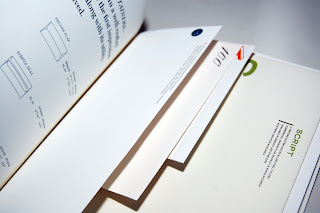
Finally found a place to post up and show off some of the print design that i've collected this summer from both Hong Kong and New York! Thought i'd throw it all in here as it relates directly to design for print, in terms of the use of stock, printing techniques, editorial examples and general things that I have collected that I have started to look at in more depth in terms of print.
A brief newsletter that I happened to come across by
Initial://
a Hong Kong based fashion label. The whole design has been printed onto an A2 sheet of paper with a textured surface printed onto it to give a rustic look. The design seems to have been printed with a full colour process and folded into a newspaper format. I particularly like the rustic look and the newspaper format, recently I have been rather obsessed with magazines/ newsletters that have been printed on newsprint and folded together, aswell as using recycled paper, the folding means that there won't be any binding involved which would save time and money. And ofcourse, if designed in a relevant way can make it look really good! Other examples I have recently discovered that follow this format include: File Magazine, HK magazine and Stool Pigeon.


Again, another magazine I found in Hong Kong; a.m. post://
A monthly free magazine that looks into art, travel, lifestyle, books and music. Eventhough I can't really read much of it as it's entirely in chinese, I still appreciate and enjoy flicking through the pages of simple, consistent layout design. This has made me realise the difference in layout using chinse/ japanese in comparison to english. Each character in chinese can be treated as a pixel, therefore the layout options seem rather flexible as the design works both vertically and horizontally. This is the moment when I slightly regret not paying more attention during my chinese lessons back in the day, although I feel that with some research, I would definitely like to experiment with chinese and english type when the opportunity arises!


A booklet from the Hong Kong Arts Centre://
The actual booklet is designed in black & white, but with a full colour cover binded to it that has been printed on a gloss coated paper, which I think works rather well. The contents cover the latest news on both the local and international art scene, in both english and chinese.


A new season catalogue by Hong Kong based fashion label
Izzue://
Again, another free booklet that I picked up due to it's design and use of print process and choice of stock. The cover has been printed in b&w with the logo embossed in. The design inside is consistent and rather basic, using the whole pages for photographs accompanied by small type, which goes straight to the point.


A leaflet from Italian Tomato://
a restaurant and bakery chain that originated from Japan. I really like the simple design of the leaflet, using the concept of the layers in a cake to determine the folding method and clearly catagorizing the different type of cakes they offer.


A Hong Kong Muji catalogue://
Simple, consistent layout, bright clear photography and clean typography; a nice example of Muji's clean cut identity.


Bag from fashioon label
Chocoolate - Hong Kong://
Another nice layout design but printed for a shopping bag, but treated more as a parcel/ piece of packaging design.


Superlife Express://
a newsletter for c!ity'super, a high end super market and retail chain based in Hong Kong. Again printed on newsprint, the vibrant colours and bold layout makes this a rather comfortable design.


Furniture catalogue for
G.O.D://
Cover has been printed in full colour with a selected gloss layer on the logo. Content wise, the whole catalogue shows photos of the products with small type containing their specification and details.


