The White Stripes - Fell In Love With A Girl music video made out of Lego.
Friday 29 October 2010
Thursday 28 October 2010
Newsletter related research 01
Exhibition newsletter for Nachleben designed by Project Projects - a New York based design agency specialising in print, identity, exhibition, and interactive work. They were recently linked to me by John and I have since found so much inspirational material from it that really reflects the type of work that I want to be working on more.
This particular newsletter caught my attention, which relates to my concept for my newsletter pitch for Leeds College of Art. I wanted it to be quite informative and academic therefore adopted the broadsheet format, incorporated more innovative layout and design direction to appeal to the younger target audience.


This particular newsletter caught my attention, which relates to my concept for my newsletter pitch for Leeds College of Art. I wanted it to be quite informative and academic therefore adopted the broadsheet format, incorporated more innovative layout and design direction to appeal to the younger target audience.


CR Handbook / 360 Magazine
Just a quick post on these two examples that show how I could possibly incorporate some type of page format that allows it to categorise the sections of the catalogue.
Creative Review Handbook 2010
For a book of this scale, it's probably a good idea that it has colour coded tabs that stick out on the side of the pages to help readers get to what they want more efficiently. Something that I could possibly consider for my catalogue, but something that needs to be thought through properly otherwise it'll probably end up looking a bit tacky and actually interfere with the functional side of it.


360 Magazine - China
This is possibly the 1st magazine that I've seen that has the pages de scaling like this to form this intriguing result, which by the way actually made it easier to flick through the pages without missing sections out! Only concern would be the cost of actually producing something like this and the amount of paper that might have been wasted during the process. Possibly something to keep in mind for a client who has plenty of money to spend on print!


Thursday 21 October 2010
Lego related ideas
A quirky video using Lego and live space, reinforcing the idea that you can pretty much make anything from the plastic bricks.

Build Anything from Studiocanoe on Vimeo.
Rymdreglages 3rd music video
Stop motion using Lego combined with some 8 Bit tunes.
And another one by the same people

Build Anything from Studiocanoe on Vimeo.
Rymdreglages 3rd music video
Stop motion using Lego combined with some 8 Bit tunes.
And another one by the same people
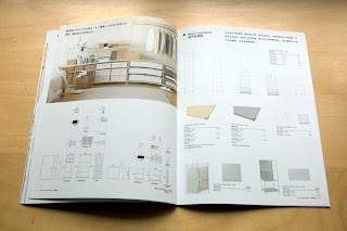
G.O.D Catalogue
GOD is a Hong Kong based high end lifestyle brand that offers desired goods (GOD = Goods of Desire) that carry a strong influence from old oriental traditions. Products range from furniture, clothes to design books and magazines. Again I've blogged this before but feel that it needs to be mentioned again particularly with the context that it fits in.
This small booklet acts as a catalogue to showcase the furniture range from GOD, but by the looks of the unconventional approach, it seems to also act as promotional material for the brand itself. The booklet has a consistent format that runs from the cover to the spreads; the concept of using an empty room to showcase all the products is used throughout. The content is filled with photographs of each product placed into this room, accompanied with the occasional figure walking about or interacting with it which helps show it's scale I guess. But overall, a relatively simple and straight to the point booklet which does it's job to inform people of the furniture it has to offer.

A nice bit of spot varnish here, always good to see.


Muji Stationary Booklet
A beautifully made Muji stationary booklet from Hong Kong. Essentially this is the type of high end quality I am looking to achieve for my catalogue but targeting students of Leeds College of Art. In terms of the production side, the cover is printed on an almost cartridge like stock, the wood effect really does compliment it and actually makes it feel quite natural. The back cover has a ruler printed on it which has also been embossed, adding to the tactile quality of it.


With regards to the layout, it's as brilliant as ever really; consistent format, tight typography & layout and sharp photographs to give an accurate image of what the products are like. In comparison to the other Muji catalogues, this particular one seems to innovate a bit more with the layout and the way the products are displayed. More photographs have been used to break up the highly formatted layout of the stationary, which keeps the whole thing a lot less catalogue like and almost becoming a book showcasing the products.


Back cover with ruler printed and embossed to add to the tactile effect.


Muji Brand
I have been a fan of Muji since the first time I stepped into one of their stores in Hong Kong and have spent so much money on anything of theirs that I can find an excuse to buy. Everything they do seems to be so well considered for a 'brandless brand', from their minimal yet functional products to their promotional materials, everything feeds back to the brand itself. Their catalogues are no exception, I've blogged about them before already but can't resist, particularly for the current brief I'm working on.
It's interesting to compare the difference in approaches that they have in comparison to the likes of IKEA; they both have a vast range of different products therefore the layout of the catalogue needs to cater for displaying all the different products while sustaining a consistent format.
Muji Life 2009 - 2010 UK
A square format catalogue that contains all of the available Muji products to the UK market. A very nice minimal and functional catalogue that displays the products in a well considered format accompanied by clean cut typography. All the products have been photographed to a high standard, in keeping with the minimalistic feel of Muji as a brand.


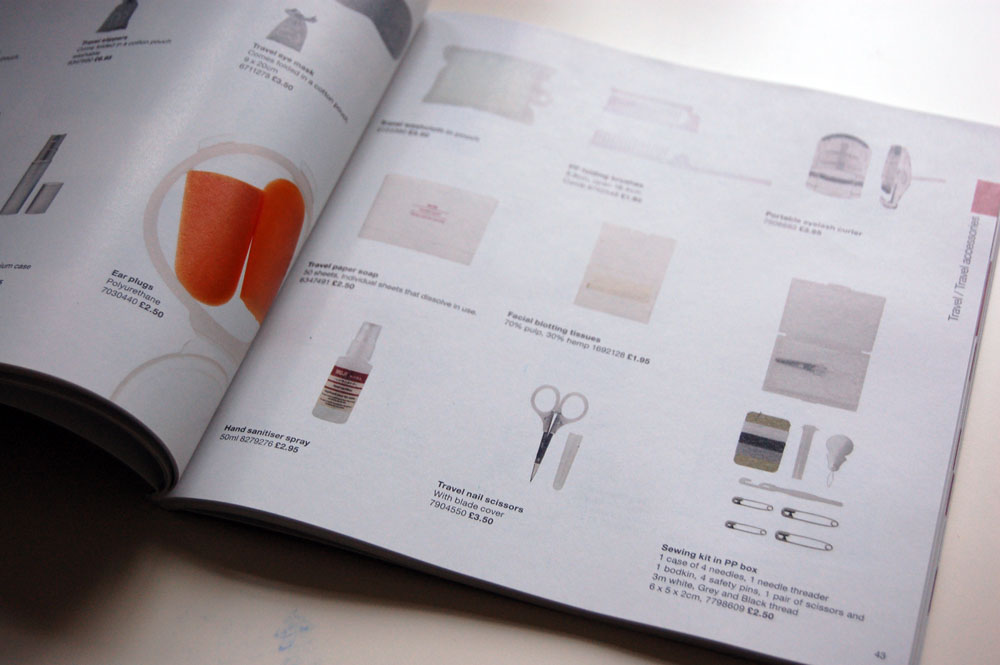
Muji Catalogue - Hong Kong
A pretty different design direction for something that is pretty much the same thing except that it's distributed in a different country; the Hong Kong Muji catalogue uses the same product photos but the layout is quite different compared to the UK version. Similar to the UK version, aswell as using the same product shots, the content is often broken up with a full page photograph of selected products. In terms of the layout, I prefer the Hong Kong version as a personal preference. Although I do appreciate the flexibility and advantages of having a square format, it can sometimes seem a bit too restricted and the results often end up too generic. As for the Hong Kong catalogue, I feel that the products and photos sit much more comfortably on the page , particularly if they full bleed images. The layout of the products seem to vary a bit more aswell which sustains the catalogues format without looking too generic. For my own catalogue, I'm thinking of testing out a slightly scaled down A4 size for the booklet but reducing the width slightly to give a more clinical / academic feel, whether or not this actually comes across as that remains to be seen.


It's interesting to compare the difference in approaches that they have in comparison to the likes of IKEA; they both have a vast range of different products therefore the layout of the catalogue needs to cater for displaying all the different products while sustaining a consistent format.
Muji Life 2009 - 2010 UK
A square format catalogue that contains all of the available Muji products to the UK market. A very nice minimal and functional catalogue that displays the products in a well considered format accompanied by clean cut typography. All the products have been photographed to a high standard, in keeping with the minimalistic feel of Muji as a brand.


Muji Catalogue - Hong Kong
A pretty different design direction for something that is pretty much the same thing except that it's distributed in a different country; the Hong Kong Muji catalogue uses the same product photos but the layout is quite different compared to the UK version. Similar to the UK version, aswell as using the same product shots, the content is often broken up with a full page photograph of selected products. In terms of the layout, I prefer the Hong Kong version as a personal preference. Although I do appreciate the flexibility and advantages of having a square format, it can sometimes seem a bit too restricted and the results often end up too generic. As for the Hong Kong catalogue, I feel that the products and photos sit much more comfortably on the page , particularly if they full bleed images. The layout of the products seem to vary a bit more aswell which sustains the catalogues format without looking too generic. For my own catalogue, I'm thinking of testing out a slightly scaled down A4 size for the booklet but reducing the width slightly to give a more clinical / academic feel, whether or not this actually comes across as that remains to be seen.


Subscribe to:
Posts (Atom)