Very nice bit of animation by Niwouinwouin and Jean Jullien://
Niwouinwouin - Catastrophe from niwouinwouin on Vimeo.
Saturday, 5 December 2009
Tuesday, 1 December 2009
Augmented Reality://
Something that we'll probably become more familiar with in the next few years as this technology becomes more widely used in interactive websites and games especially. Although this might not be the type of technology I'd be looking at, I think it's interesting and useful to be aware that such a thing exists and that it can become a common part of our lives in the future in terms of the way we interact with design for screen.
In the words of Wikipedia://
"Augmented reality (AR) is a term for a live direct or indirect view of a physical real-world environment whose elements are merged with (or augmented by) virtual computer-generated imagery - creating a mixed reality. The augmentation is conventionally in real-time and in semantic context with environmental elements, such as sports scores on TV during a match. With the help of advanced AR technology (e.g. adding computer vision and object recognition) the information about the surrounding real world of the user becomes interactive and digitally usable. Artificial information about the environment and the objects in it can be stored and retrieved as an information layer on top of the real world view"
And in my own words in case that didn't make much sense://
Augmented reality is the technology of a digital device being able to render virtual objects into reality through a digital medium. ( that probably didn't make much sense either so I'll allow the examples below to explain instead!
Mapping system demonstrated on the Apple iPhone, which shows the possible uses of this technology://
Something you can try at home yourself://
GE Ecomagination
A nice site with some really nice interactive elements.
You can test out this interactive technology by clicking on the link below and following the simple instructions.
Augmented Reality Test
Further instructions and the results can be viewed here://
Interactive design://
Some amazing interactive websites that I have accumulated over the past year or so. Thought this would be the ideal place and time to start posting them up to share on a regular basis. ( hopefully)
{21.19} - needs updating...
MCBD
Website for MCBD, a London based advertising agency. Their website incorporates a 3D interactive flash format. I've seen alot of flash websites, but 3D interactive ones are rare so, the site is designed really well I think, something unexpected happens after each click and the page layout will transform with some nice looking motion graphics. Love the way the screen angle changes according to your cursor.

The Eco Zoo
An even better interactive site that incorperates a 3D interactive interface. Some really nice visuals! This site was designed by Tokyo based Enjin who themselves have a rather nice interactive site.


Vectorpark
A completely interactive based website, that invites the user to click their way to solve puzzles that are created out of simple vector graphics. One word: AMAZING

Tuesday, 17 November 2009
It's melting://byMil
In relation to the laser cut induction, I thought this was a rather inspirational piece by Hong Kong based Milkxhake.
Sunday, 15 November 2009
Laser Cut://
Went down to the woodwork department the other day to get an induction on using the laser cut machine. This was relevant to my research into design for print as it is an area of design that I've always wanted to look into. Also the cover of my ninja catalogue needs to be negative embossed so I needed to get the 'plate' cut out that I could use to emboss with.
Aswell as teaching us how to use the laser cutter, there were quite few examples showing us the type of things and quality that it could produce://

This intricate design demonstrates the small detail and accuracy that can be produced, aswell as it being able to cut through 2mm acrylic sheets.

One thing I didn't know about what that even images can be engraved onto a surface. There were quite detailed settings to the cutter, that can be adjusted depending on the stock, and what kind of quality you're trying to achieve. This one in particular was set to a high laser velocity, which makes the image quite dark with a fairly deep cut into the stock, creating an almost 3D texture to it.

The machine can cut pretty much any material that can fit under it except, metals and any direct mirrored surface as this would bounce the laser back and potential burn through the machine itself. Rubber was one that was not recommended eventhough it can cut through it due to the toxic fumes of burning into rubber. The example above shows a negative image that has been engrave onto a piece of wood, which would act as a stamp.


A plate showing examples of the different preset cutting settings.


Print processes://

{ Left page } The 07/08 fasion show invitation for Lacoste was designed by Yorgo. a UK based designer and art director. Rather than designing and printing on paper to be distributed out to the customers, this design contains an invite on a piece of wood that has the information etched onto it.
{ Right page } Another invitation design, but this time the design is very minimal but with emphasis on the material that it prints on, which is infact a heavy piece of metal with the Lacost logo magnet attached onto it. A very simple and effective concept that was distributed out to it's invitees, who would attach it to their fridge, a design like this really does show the importance and the impact the stock can have on a design.

Lacoste promotional material, again by Yorgo. The design is part of a promotional material that accompanies a silk scarf in reference to the yachting and the theme of 'nautical'. The 2mm plexiglass design resembles a map compass and was printed with a screen printing process.

Nice packaging for a collection of visual cards by Japanese design agency Taste Inc. The design uses a nice wooden material for the box design, with what seems like a bronze foil block on a negative embossed surface.

Another nice piece of work from Taste Inc, this time a very slick publication for the 'Half a moon' font. The cover and the content involves a combination of delicate die cut with simple block layout on red and black stock, creating a very nice visual outcome.
Friday, 6 November 2009
Smell this://
Bought some new fragrance today and look it's embossing and debossing on a tinned packaging! Got rather excited so thought i'd share it here with people who might also appreciate it://


Tuesday, 3 November 2009
Made you look
Made You Look - Stefan Sagmeister & Peter Hall
Nice use of materials for the packaging alongside the digital print to result in an interactive effect with the user. Something that I would look consider when designing the packaging for my book.

Nice use of materials for the packaging alongside the digital print to result in an interactive effect with the user. Something that I would look consider when designing the packaging for my book.

Saturday, 31 October 2009
Found://
A couple of bits I picked up/ collected during my visit in Manchester://
A5 booklet for the Manchester Literature Festival 09


Chinese Arts Centre booklet, with a rather nice foil stamp on a debossed surface design for the front cover://

A5 booklet for the Manchester Literature Festival 09


Chinese Arts Centre booklet, with a rather nice foil stamp on a debossed surface design for the front cover://

Friday, 30 October 2009
FILE
Again, another piece of book design that I have purchased this year and thought i'd do a quick post on it as part of some research for the design for print module. It is a 32 page A3 book that is printed on A2 newsprint and folded in half like a newsletter. The contents of the book covers music related articles outside the mainstream music scene.
I actually bought this simply because of the stock that it was printed on as the book was sealed up in the shops at the time. But luckily it didn't fail to impress; the layout and overall design of the book is simple but very clean. I'm liking the way the ink almost leaks into the paper and prints onto the other side of the page. From what I can see, a possible 16 column grid was used for the general layout of the book, which offers a refined and consistent design throughout. For the majority of the book, only black was used to print, except for the certain pages where there are photography, in which case a possible process colour print was used.


I actually bought this simply because of the stock that it was printed on as the book was sealed up in the shops at the time. But luckily it didn't fail to impress; the layout and overall design of the book is simple but very clean. I'm liking the way the ink almost leaks into the paper and prints onto the other side of the page. From what I can see, a possible 16 column grid was used for the general layout of the book, which offers a refined and consistent design throughout. For the majority of the book, only black was used to print, except for the certain pages where there are photography, in which case a possible process colour print was used.


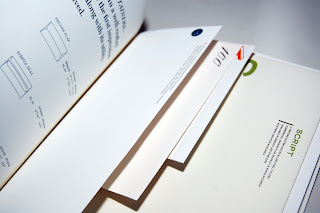
Dear: by Mohawk Fine Papers Inc.
A rather fascinating and well produced book by Mohawk Fine Papers Inc. which borrows the context of writing letters and the importance of stock type, language uses, font, print process etc to promote and inform people of what the company has to offer.
The book's main message is that the paper used can enhance and make a message of a letter more meaningful. The contents of the book, cover every single aspect of letter writing starting from the type of message you intent to deliver, through to the language used, who to address the letter to, type of paper to use to the way you fold your letter and the choice of envelope to protect your letter in.
The final page of the book contains all the stock, print/ cut process and design specifications of the entire contents of the book, which is rather useful://
Cover://
298 gsm, printed black, spot dull varnish + single level emboss.


Examples of the different print techniques ranging from foil stamp to registered emboss.


Examples of different letterhead designs.

And finally, a few envelope examples that too have been binded into the book.

Sunday, 25 October 2009
Manchester visit 09' ://
A brief selection of photographs that document my visit to Manchester Urbis exhibition, Home Grown - The Story of Hip Hop as part of an introduction to our critical & theoretical studies.

I found the general layout of the exhibition quite well organized and the work was displayed in a consistent format. I particularly liked the bold type and layout of the text, which went well with the hip hop theme i guess.


Might not be able to tell on from the photo, but this was printed in a almost half tone like effect://

Some rather interesting documents from the early hip hop era, reflecting some nice layout/ editorial designs://


Some duo toned newsletter prints://


A few nice pieces of photograph displayed through light boxes. And look, I found a ninja!!!! (Refer to my 'What is good' project if you're confused)


A collection of record designs and their sleeve designs. Although not entirely my kinda thing, it still looked rather impressive as a collection; reflecting the importance of exhibition design and how to plan the layout of the place.


Subscribe to:
Comments (Atom)