Friday, 6 November 2009

Smell this://

Bought some new fragrance today and look it's embossing and debossing on a tinned packaging! Got rather excited so thought i'd share it here with people who might also appreciate it://


Tuesday, 3 November 2009

Made you look

Made You Look - Stefan Sagmeister & Peter Hall
Nice use of materials for the packaging alongside the digital print to result in an interactive effect with the user. Something that I would look consider when designing the packaging for my book.

Saturday, 31 October 2009

Found://

A couple of bits I picked up/ collected during my visit in Manchester://

A5 booklet for the Manchester Literature Festival 09


Chinese Arts Centre booklet, with a rather nice foil stamp on a debossed surface design for the front cover://

Friday, 30 October 2009

FILE

Again, another piece of book design that I have purchased this year and thought i'd do a quick post on it as part of some research for the design for print module. It is a 32 page A3 book that is printed on A2 newsprint and folded in half like a newsletter. The contents of the book covers music related articles outside the mainstream music scene.

I actually bought this simply because of the stock that it was printed on as the book was sealed up in the shops at the time. But luckily it didn't fail to impress; the layout and overall design of the book is simple but very clean. I'm liking the way the ink almost leaks into the paper and prints onto the other side of the page. From what I can see, a possible 16 column grid was used for the general layout of the book, which offers a refined and consistent design throughout. For the majority of the book, only black was used to print, except for the certain pages where there are photography, in which case a possible process colour print was used.


Dear: by Mohawk Fine Papers Inc.

A rather fascinating and well produced book by Mohawk Fine Papers Inc. which borrows the context of writing letters and the importance of stock type, language uses, font, print process etc to promote and inform people of what the company has to offer.

The book's main message is that the paper used can enhance and make a message of a letter more meaningful. The contents of the book, cover every single aspect of letter writing starting from the type of message you intent to deliver, through to the language used, who to address the letter to, type of paper to use to the way you fold your letter and the choice of envelope to protect your letter in.

The final page of the book contains all the stock, print/ cut process and design specifications of the entire contents of the book, which is rather useful://

Cover://
298 gsm, printed black, spot dull varnish + single level emboss.


Examples of the different print techniques ranging from foil stamp to registered emboss.


Examples of different letterhead designs.


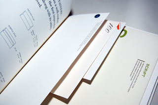
And finally, a few envelope examples that too have been binded into the book.
Sunday, 25 October 2009

Manchester visit 09' ://

A brief selection of photographs that document my visit to Manchester Urbis exhibition, Home Grown - The Story of Hip Hop as part of an introduction to our critical & theoretical studies.


I found the general layout of the exhibition quite well organized and the work was displayed in a consistent format. I particularly liked the bold type and layout of the text, which went well with the hip hop theme i guess.


Might not be able to tell on from the photo, but this was printed in a almost half tone like effect://


Some rather interesting documents from the early hip hop era, reflecting some nice layout/ editorial designs://


Some duo toned newsletter prints://


A few nice pieces of photograph displayed through light boxes. And look, I found a ninja!!!! (Refer to my 'What is good' project if you're confused)


A collection of record designs and their sleeve designs. Although not entirely my kinda thing, it still looked rather impressive as a collection; reflecting the importance of exhibition design and how to plan the layout of the place.