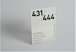
Some bold type driven wayfinding design work for the North Glasgow College designed by Marque.The range of signage and design direction utilises bold typography that's appropriately applied to the environment, offering a functional way finding system while complimenting the surroundings.
The use of bold type is relatively simple, the information is stripped down to the bare minimum
With studios in New York, Glasgow and London, Marque have a very strong and inspirational portfolio of work and envious client list ranging from infographics and signage for academic organisations to branding materials for high end restaurants.
A few other projects that caught my attention that either relates to my design practice and the type of work I want to produce or is relevant to my current Living Space brief.
Haggs Gate
Marque were commissioned by an investment division of National Australia Bank to collaborate with a great team of specialists on creating the brand and marketing campaign for a contemporary development of apartments and penthouses on Glasgow's south side.
A strong set of materials that cover the vast array of design materials that I have been working towards for the Living Space brief. Although my target audience is quite different to the ones that these are designed towards, it's still relatively inspiring to look at the quality and breadth of work produced towards a similar sector.
Brand strategy and communication materials for Medini - what seems to be a land investment company based in Malaysia. Nevertheless, the materials delivered by Marque are outstanding as ever, the design materials range from publications, website design to design guidelines and colour specs.
I particularly like this poster like print, the range of text and images really compliment each other, the layout itself is pretty solid aswell even though several colours are used which can often confuse and overcomplicate things.
Monday, 29 November 2010
Subscribe to:
Post Comments (Atom)


No comments:
Post a Comment